I was very critical (and remain so) of the Remington Allen Organ “Dual Use” ordinance. What began as an important task of creating our townships first much needed community serving mixed use ordinance devolved into building an ordinance to suit a sketch plan and a developer. The process in my opinion was backwards and rushed. At least that was my observation as an outsider looking in.
I believe the result is a euclidean segregation of uses on an auto centric foundation. Meaning the sketch plan represents an apartment complex and a strip box commercial development smushed together. No real integration or compatibility. Not a mixed use development.
To make matters worse of course, the whole process was in my opinion sullied since the realtor of the project was a seated township commissioner. (Who at the time sat on the planning and zoning committee).
When I critique I always make it a point to give positive suggestions. In this case I sent the Board of Commissioners links outlining what I felt was a true mixed use development in Lancaster. Obviously, it fell on deaf ears. For two years now I’ve read about this development. Finally yesterday I was in Lancaster for work and I had the opportunity to check it out in person. Also coincidently google maps updated it’s streetview of the project. Here are a bunch of screen grabs.
This in my opinion represents the type of mixed use development we should be promoting. This is the type of development that will attract the coveted “young professional” demographic. This fits in line with my vision of becoming an exceptional place. Not another cookie cutter, cut and paste community.
I believe pictures tell the story. This is a beautifully designed and fully integrated mixed use community. Every detail seems to be well thought out. Everything works. Everything is contextually sensitive. The place oozes charm. People here can buy with confidence that they will maintain their property values.
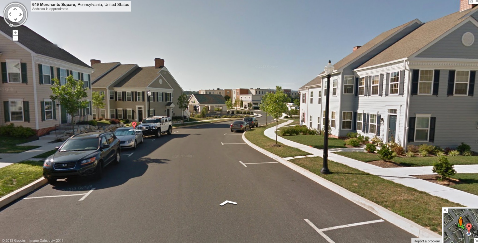
One of 3 main residential sections looking towards the centralized “downtown” commercial. I LOVE the design standards of these homes.
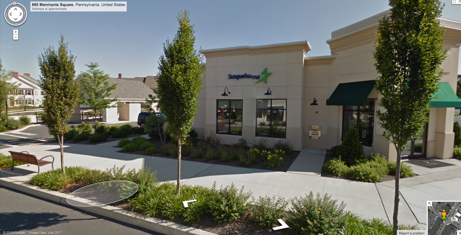
Walking into the commercial area, there are Auto uses BUT everything is properly scaled. This bank works (even with the drive through) because of scale. Nothing in this entire development is highway geometry. Even with the auto uses, the focus was on pedestrians. We have a habit of over-engineering and supersizing everything here in LMT. This development wouldn’t work with turning lanes and supersized roads. No one would walk. It wouldn’t have any charm.
And you know what? I was here during “rush hour”. Cars somehow managed to get around. Best of all since the roads were built “right sized” traffic moved slowly. Not congestion mind you. But calmed. The foot traffic was amazing.
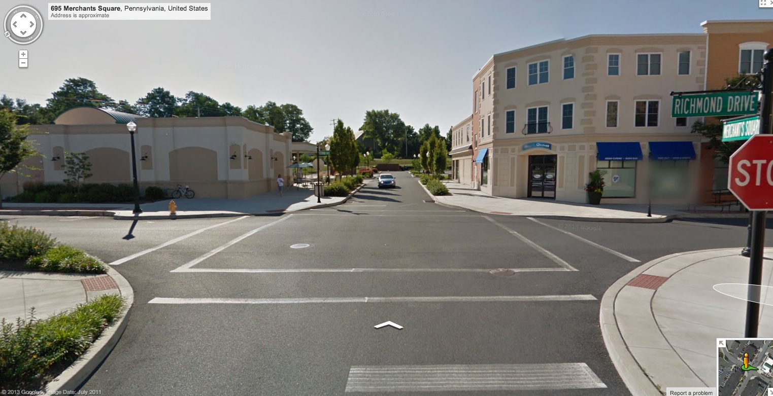
Walking between the Bank (outparcel also has a subway), the Mainstreet commercial with apartments above on the right and up to the left a mini mart! Again, everything works and fits together cause this design emulates a small town. Everything is “right sized”
No need for a signal here cause traffic moves at appropriate speeds so the 4 way stop works fine. (Again these are google images and before full build out, I was here yesterday during the “rush”)
And one of the Main desirable traits of mixed use, “the sell” really is traffic overall is reduced cause people actually walk places!
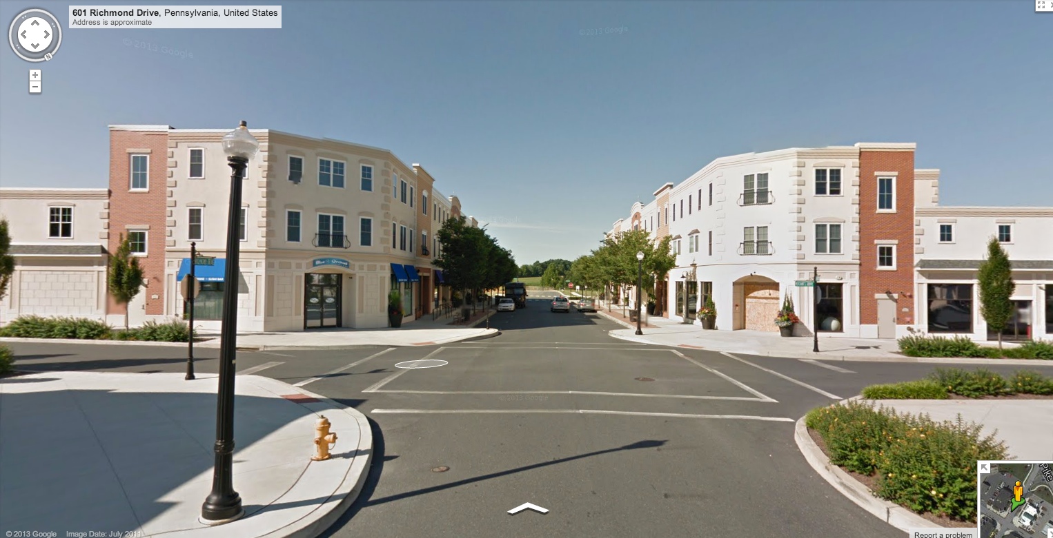
Between the Bank and Convenience store looking down “Main”. Here we have neighborhood commercial with apartments above.
Some of the commercial included: 4 restaurants ranging from fancy to “Faster” food.
The Charlotte Shoppe (gift shop), A spa, A doctor’s office, Spycom offices of a home security firm I think, Drycleaners, Mathnasium a tutoring facility.
The centralized walkable location of this corridor is what makes this development vibrant. It’s readily accessible to all 3 of the residential components the towns, the singles and the apartments.
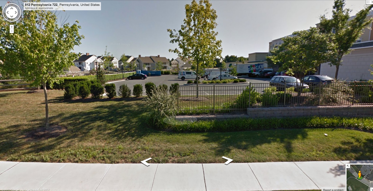
Everywhere you look is beefy landscaping featuring 4 season appeal. This area will look nice in the dead of winter thanks to use of evergreens. You can tell the developer put thought into this. They didn’t just “meet the minimum requirements”
This is the parking for the “Main Street” neighborhood commercial. It’s BEHIND the storefronts. So the walk down main is pleasant since car storage is focused behind the buildings. This is parking for the commercial usage and the apartments.
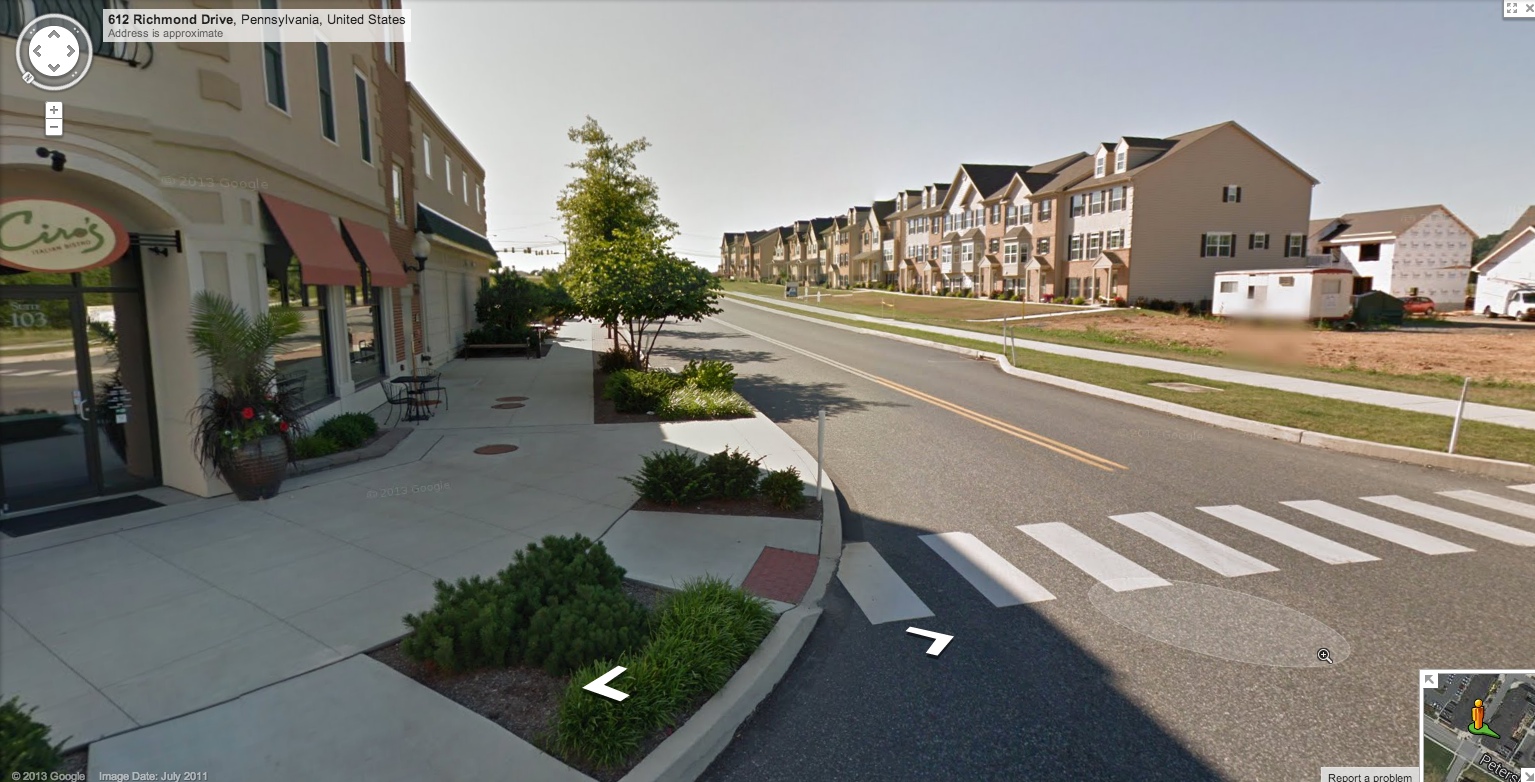
The townhouse phase is still being built out and are in high demand. People WANT to live in walkable communities! This would possibly be considered a connector road but there are no reverse frontages. The townhomes feature an alley where cars are parked and homes are serviced with garbage ect. Bump outs and crosswalks calm traffic. More street facing retail. I saw only one commercial vacancy in the whole project that featured a “coming soon” sign.
