Hamilton Crossings is being sold to us as a “Promenade esque” walkable “town center concept”. For the record I am in favor of this type of walkable/towncenter lifestyle scale development on the Hamilton Corridor. My concerns are two-fold 1. the TIF (although I am listening to some good arguments in favor and my stance has softened) and 2. That we are getting what we are being sold.
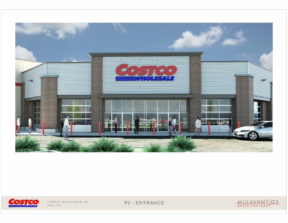
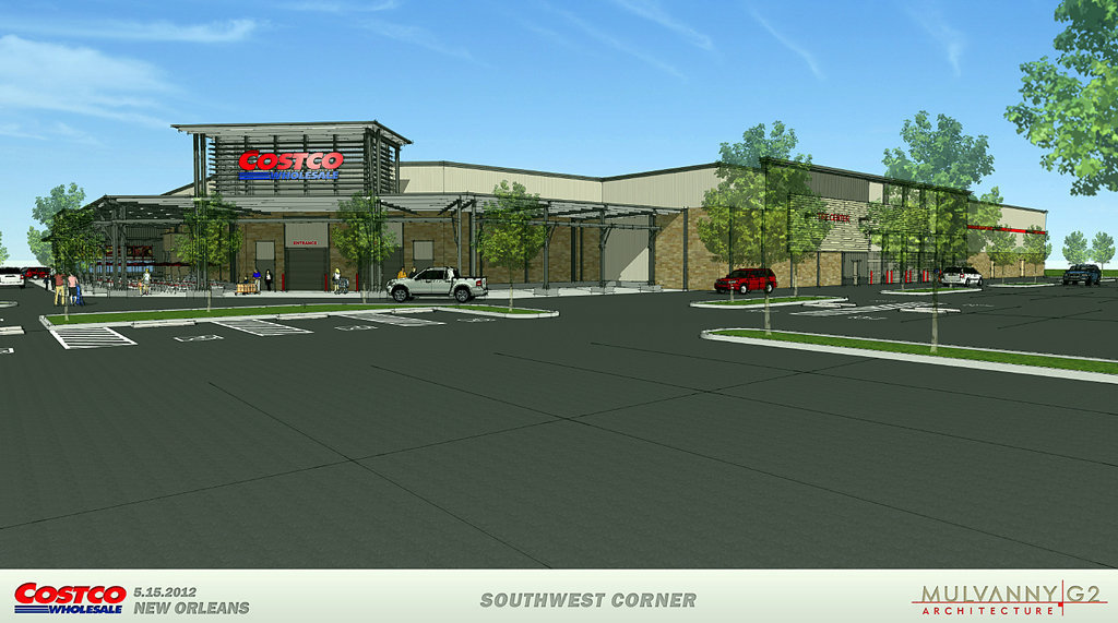
Below is the Costco rendering that was posted on the Hamilton Crossings Facebook page. I have major concerns with this. We were sold a “Lower Macungie Specific” design. Something unique and “high end”. This appears to be a variation of the cookie cutter Costco box. Nothing special at all. In fact it reminds me of the front of a pep boys or some other auto repair shop.
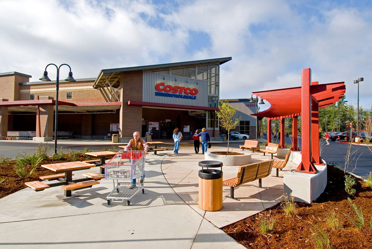
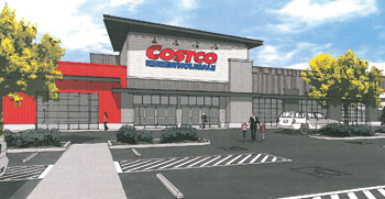
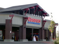
To contrast here are some innovative designs I have found for Costco’s recently built. The point is, we can do better and as a community we should demand better. Are you willing to settle for above when we were promised a “Lower Macungie Specific” design comparable to the promenade?
Why is this important?
First, it’s ok to be choosy. We have to come to terms with the fact we’re an attractive place for development. We should not be ok with every mediocre proposal that comes down the pike. Since we are an attractive place for developers we should and can demand a higher standard. The quality of our commercial spaces affect all our property values which in turn affects our school district and community as a whole.
Second, think about the Promenade for a second. The developer and current township commissioners make comparisons to the Promenade. When you walk around it does it feel like your walking around a parking lot next to a giant soul-less box? Or when you walk down the middle does it feel like your walking down “Main St. USA”? A pleasant place to hang out. Next, think about why the promenade works and why people travel to get shop there. Yes, good design is about making a place attractive, but it’s more then that. It’s also scale so you truly have walkability. Scale is what makes walkability work. Auto scale vs. people scale. Auto scale using highway geometry (parking lots) creates a place dangerous for people. Every decision should be geared towards creating an an environment that is safe, comfortable, and attractive to pedestrians.
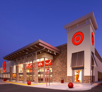
And just for good measure here is a really nicely designed Target IMO. Note: 3 of these pictures are actual stores. Remember, everything looks beautiful in artists watercolors. If the Costco rendering looks drab in a water color it is 10x worse in real life.
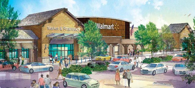
Even Wal-Mart is slowly “getting it”
